
How Do I Make My Online Store Look More Established as a Small Brand?
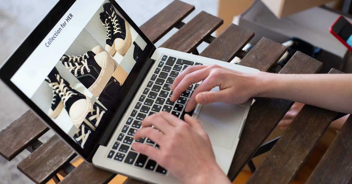
How to Make Your Online Store Look More Established
An established store looks consistent, complete, and deliberate from the first click. Shoppers do not need a huge catalog or a big team to feel that. They need clear pages, strong merchandising, and a buying flow that feels thought through.
The fastest levers are simple. Standardize your product page layout. Tighten your product copy. Use matching visuals. Add complementary offers that make sense. Make every promotion look like part of the brand, not a last-minute banner.
A lot of small stores focus on surface polish only. Surface polish helps, but product page conversion usually improves faster when the page also helps shoppers decide what to buy together, what they save, and why the offer belongs there.
If your store already looks solid but your product pages still feel incomplete, a buy together and save offer can add polish without a redesign.
What Does an "Established" Online Store Actually Look Like?
An established online store usually looks finished, not fancy. Shoppers read "established" as clear presentation, complete information, intentional product selection, and a checkout experience that does not raise questions.
That means your pages follow a pattern. Product titles are clean. Photos feel like they belong to the same brand. Descriptions answer fit, materials, use case, and what happens next. Shipping, returns, and payment details are easy to find.
It also means your merchandising feels intentional. A strong store does not throw random recommendations under every item. A strong store shows complementary products, bundles, or mix-and-match bundles that fit the main product and support the buying decision.
The difference is easy to spot.
Weak: "You may also like" followed by four unrelated products and a sitewide discount banner. Stronger: "Buy together and save" with two matching add-ons, exact savings, and a branded storefront widget placed near the add-to-cart area.
Small brands often assume "homemade" means the logo or colors look off. Sometimes that is true. More often, "homemade" means the store feels unfinished because the information is thin and the offers feel random.
Why Looking Established Matters for Small Brands
Looking established matters because first-time shoppers decide fast whether your store feels safe to buy from. Small brands do not get the benefit of name recognition, so presentation has to do more work.
A polished storefront builds trust. A complete product page improves product page conversion. Intentional offers can lift average order value because shoppers understand what to add and why it belongs with the main purchase.
This matters even more if you sell on OpoShop as an independent operator. You are often handling branding, product setup, promotions, and customer questions in the same day. You do not need more moving parts. You need a storefront that looks steady and sells clearly.
Bigger brands often win on familiarity. Small brands can still win on clarity. Clear pages, branded offers, and exact savings do a lot of trust-building in a short space.
How to Make Your Store Look More Established Without a Full Redesign
You do not need a full redesign to make your store look more established. You need a tighter system across the product page, visuals, offers, and checkout path.
Start with structure. If one product page has detailed sizing, another has one sentence, and a third has no shipping note, the whole store feels uneven. Consistency makes the catalog feel bigger than it is.
Then fix the copy. Shoppers should not have to guess what the product is, who it is for, or what makes it worth buying. Short, specific copy usually beats vague brand language.
Use one visual system across the catalog. Matching photo treatment does more for perceived polish than adding more design elements. The goal is not more decoration. It is less friction.
Then add complementary offers near the buying moment. Fixed bundles work well when the pairing is obvious. Mix-and-match bundles work well when shoppers want choice but still need guidance. Both can make a page feel more complete if the bundle presentation is clean.
For OpoShop merchants, this is where no code tools matter. If you can publish a branded offer in minutes, you can improve presentation without theme edits or a developer.
For OpoShop merchants, Bundlr is a simple way to add fixed or mix-and-match bundles with a storefront widget, without coding or theme edits.
Best Ways to Add Polish Fast: Design Tweaks vs Merchandising Improvements vs Offer Strategy
The fastest polish usually comes from a mix of small design cleanup and stronger merchandising, not from a full visual overhaul. If time is tight, start where shoppers make buying decisions.
| Approach | What it changes | Effort | Fastest payoff |
|---|---|---|---|
| Design tweaks | Spacing, fonts, image consistency, button hierarchy | Low to medium | Better first impression |
| Merchandising improvements | Product order, related items, bundle placement, savings visibility | Low | Better product page conversion and higher basket size |
| Offer strategy | Fixed bundles, mix-and-match bundles, checkout discounts, promotion rules | Low to medium | More intentional buying flow and stronger average order value |
A lot of founders assume design is the whole answer. Design helps the store look cleaner. Merchandising helps the store feel smarter.
That distinction matters. A clean page with weak recommendations still feels thin. A well-merchandised page with a branded bundle widget, exact discount math, and relevant add-ons often feels more established because the store is helping the shopper buy.
Do bundle offers make a store look more professional or more discount-heavy? The honest answer is both are possible. A random markdown slapped across the page looks cheap. A buy together and save offer with matching products, clear savings, and branded presentation looks intentional.
Common Mistakes That Make a Small Store Look Less Established
Small stores usually look less established for a few repeat reasons. The problem is not always bad design. The problem is often inconsistency.
One common mistake is uneven product pages. If some pages are detailed and others are bare, shoppers start doubting the catalog. The sale feels less certain.
Another mistake is cluttered offers. Too many badges, popups, banners, and discount messages make the storefront feel noisy. One strong offer usually looks better than four weak ones.
Weak product recommendations also hurt. If the storefront widget suggests unrelated items, the store looks automatic instead of curated. Complementary products should feel chosen, not dumped from the catalog.
Random discounting is another problem. Promotions that change every few days with no clear structure can make a brand look desperate. Credible promotions usually have a clear reason, a clear savings message, and a clear place on the page.
Confusing navigation and checkout friction also show up fast. In your OpoShop store, shoppers should understand where to click, what they are buying, and what the discount does before they reach OpoShop's checkout.
What We Recommend for OpoShop Merchants Who Want a More Polished Storefront
For OpoShop merchants, the best move is usually to keep the storefront and checkout clean, then add merchandising that makes the product page feel more complete. You do not need to rebuild the site to get there.
We recommend using OpoShop for the storefront, product setup, and checkout flow, then using Bundlr to add intentional product bundles through a branded storefront widget. That setup works well if you want fixed bundles, mix-and-match bundles, clear buy together and save offers, and exact checkout discounts without code.
This is the part many small brands miss. Looking established is not only about how the store looks from far away. Looking established is also about how confidently the store sells on the product page.
If you want the storefront to feel more complete without opening a support ticket or touching your theme, start with the offer layer. Add the right bundle. Show the savings clearly. Keep the presentation branded.
Best answer: If your OpoShop store already has solid branding but the product page still feels thin, add structured ecommerce merchandising before you think about a redesign. A clean buy together and save widget, relevant product bundles, and exact checkout discounts can make the storefront feel more established while also increasing bundle revenue and average order value.
Want a more polished storefront and higher average order value? See how a cleaner bundle setup fits into your store.
FAQs
What makes an online store look more trustworthy to shoppers?
A trustworthy online store looks complete, consistent, and easy to buy from. Clear product details, matching visuals, visible policies, and a confident checkout path do more for trust than extra design effects.
Can a small brand look established without redesigning the whole site?
Yes. Most small brands can look more established by tightening product pages, standardizing visuals, and cleaning up offers before touching the full site design. A better structure usually changes perception faster than a full rebuild.
Should I add product bundles to make my store feel more polished?
Yes, if the bundles are relevant and presented cleanly. Product bundles make a store feel more polished when the products belong together, the savings are clear, and the storefront widget looks branded instead of generic.
How do I run promotions without making my brand look cheap?
Run fewer promotions and make each one feel deliberate. Fixed bundles, buy together and save offers, and exact checkout discounts usually look stronger than scattered markdowns across the storefront.
What is the fastest way to improve product page conversion and presentation?
The fastest move is to improve the product page structure and add one intentional complementary offer near add to cart. Clear copy, better visual consistency, and a relevant bundle often make the page feel more complete right away.
Summary
A small brand looks more established when the storefront feels consistent, the product page feels complete, and the offers feel intentional. You do not need a full redesign. You need clearer structure, stronger copy, cleaner visuals, and merchandising that helps shoppers buy with confidence.
For many OpoShop merchants, that means keeping the storefront simple and adding polished bundle offers where they matter most. If you want everything you need to sell more per order without code, start with the part shoppers see right before they buy.


