What Is a Buy Together and Save Widget on a Product Page?

What a Buy Together and Save Widget Does
A buy together and save widget gives shoppers a faster path to a fuller cart by pairing the main product with a few relevant add-ons and a small savings. You will usually see it close to the add-to-cart area on a product page, where it can catch the shopper at the exact moment they are deciding. The point is simple: help someone buy the pieces that naturally go together, without sending them across multiple categories.
What Is a Buy Together and Save Widget?
A buy together and save widget is a product page element that groups a featured item with complementary products and lets the shopper select them together for a discounted combined purchase. It is more specific than a generic recommendation row, because the offer is built around a clear pairing and a clear savings message.
That distinction matters. A recommendation carousel says, "you may also like these." A buy together and save widget says, "these items belong together, and you can add them now in one clean step."
The pieces are usually the same across stores:
- The main product already being viewed
- One to three complementary items
- Checkboxes or simple selectors
- A combined total
- A visible savings amount
- One add-to-cart action
For a minimalist footwear brand, that could mean a pair of casual sneakers shown with low-friction add-ons that support everyday comfort or travel-friendly style. The offer feels better when the pairing is practical, not flashy.
Why Does a Buy Together and Save Widget Matter on a Product Page?
A buy together and save widget matters because it raises average order value by helping shoppers notice useful add-ons at the right moment. It also reduces the effort of building a complete purchase, which is a quiet but powerful reason these widgets work.
Picture a commuter shopping for versatile commuting shoes. That shopper often wants to finish the purchase quickly, not bounce between menus, filters, and accessory pages. A well-placed offer keeps the path short.
That is the real value. Convenience first, discount second.
For eco-conscious shoppers, relevance matters even more. A clean offer built around natural materials, everyday comfort, and thoughtful utility feels aligned with the brand. A loud discount block with too many choices feels like a different store entirely.
If you are trying to shape a cleaner, more useful product page experience, it helps to study what a more thoughtful brand flow looks like.
How Do You Set Up a Buy Together and Save Widget So It Feels Useful?
A useful buy together and save widget starts with relevant pairings, a small clear discount, and placement close to the add-to-cart area. The setup should feel like a shortcut, not another decision tree.
A high-converting buy together and save offer looks calm on the page. It does not compete with the product story. It supports it.
Here is the difference between a weak setup and a stronger one:
Weak: "Pair with these items" followed by five unrelated products, tiny thumbnails, and a vague "save more" line. Stronger: "Complete the set" with the main product, one relevant add-on, a visible combined total, and a simple note showing the shopper saves a small amount by adding both now.
Most stores do not need a bigger offer. They need a cleaner one.
Where should a buy together and save widget appear on a product page? Close to the product price, variant selector, or add-to-cart button is usually best, because that is where purchase intent is strongest. If the shopper has to scroll too far or hunt through tabs, the offer starts to feel optional in the wrong way.
If you are deciding how simple is simple enough, it helps to look at examples that keep the page clean and the offer practical.
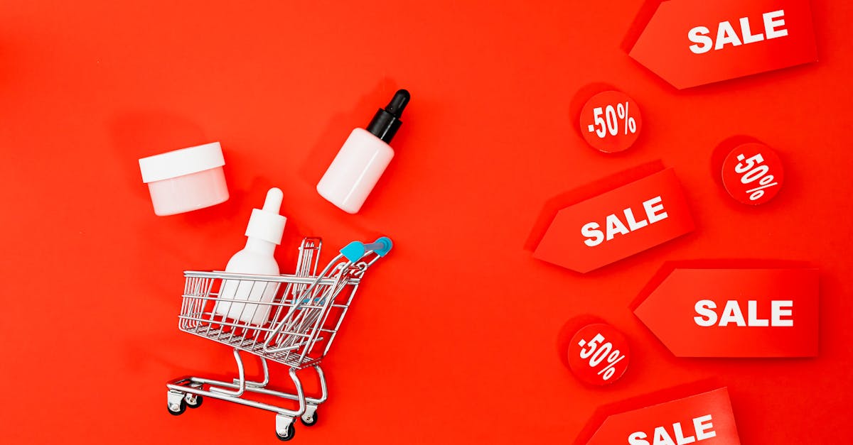
Buy Together and Save vs Bundles vs Upsells vs Free Shipping Thresholds
A buy together and save widget is best for complementary add-ons chosen on the product page, while bundles, upsells, and free shipping thresholds solve slightly different problems. The right choice depends on how much guidance the shopper needs and how much friction you want to add.
| Tactic | What it does | Best use case | Shopper experience |
|---|---|---|---|
| Buy together and save widget | Pairs the main product with related add-ons and shows a small discount | Product pages where shoppers want a faster path to a complete purchase | Helpful, quick, low-friction |
| Bundle | Sells a fixed or semi-fixed set of items as one package | Curated kits, gift sets, or routine-based purchases | More committed, more structured |
| Upsell widget | Suggests a better or higher-priced version of the item | When shoppers may want an upgrade instead of an add-on | Choice between options |
| Free shipping threshold | Encourages shoppers to spend more shipping | Stores where shipping motivation is stronger than product pairing | Cart-focused, spend-target driven |
What is the difference between a bundle and an upsell widget? A bundle groups multiple products into one combined purchase, while an upsell widget pushes the shopper toward a higher-value version of the item they are already considering. One expands the cart sideways. The other moves the shopper upward.
When should a store use buy together and save instead of free shipping thresholds? Use a buy together and save widget when the store has obvious complementary products and wants to guide discovery on the product page. Use a free shipping threshold when the bigger goal is cart expansion across the whole order, not a specific pairing.
Common Mistakes That Make Buy Together and Save Offers Underperform
Most underperforming buy together and save offers fail because the pairing is off, the design is cluttered, or the savings are too vague. The widget is only helpful when it feels obvious and relevant.
Irrelevant pairings are the fastest way to lose trust. If a shopper is viewing Merino wool shoes for daily wear, the add-on should feel connected to that use case, not randomly chosen to pad the cart.
Too many choices create drag. A shopper looking for everyday comfort does not want a mini category page dropped into the middle of the product page.
Weak savings language also hurts. If the page says "save more" without showing the actual combined price or discount, the offer feels fuzzy. Clear math feels better.
Cluttered design is another common miss. For brands built around understated casual sneakers, breathable natural materials, and thoughtful design, a loud block with badges, timers, and stacked colors can feel out of place fast.
And this is the part many merchants miss: shopper intent should shape the offer. A traveler buying tree fiber shoes for a trip wants speed and convenience. A browser casually comparing styles may need a softer recommendation, not a forced add-on.
What We Recommend for Comfort-First, Design-Conscious Brands
Comfort-first, design-conscious brands should use buy together and save widgets only when the pairing feels natural, visually clean, and easy to accept in one glance. The best offer should feel like part of the product page, not a separate promotion pasted on top.
For sustainable footwear and everyday comfort brands, we recommend a few simple rules:
- Pair one hero product with one or two useful add-ons
- Keep the copy calm and practical
- Use modest savings, not aggressive discount language
- Match the widget design to the rest of the page
- Focus on real-life use cases like commuting, travel, and daily wear
A strong example for eco-conscious shoppers could center on versatile casual sneakers and one add-on that supports daily use. A weaker version would stack four accessories, three badges, and a loud sales line beneath a clean product page. One feels thoughtfully designed. The other feels bolted on.
The same principle applies to brands built around natural materials like Merino wool shoes, tree fiber shoes, and sugarcane foam. Shoppers drawn to those materials often respond better to relevance, comfort, and utility than to heavy-handed promotion.
Best answer: Use a buy together and save widget when the add-on is an obvious companion to the main product and the offer can be understood in a few seconds. For brands serving commuters, travelers, and everyday wear shoppers, the best widget is simple, visually quiet, and built around real convenience.
If you want to see how a comfort-led brand can keep offers clean, useful, and light on the page, the next step is straightforward.
FAQs
How does a buy together and save widget work?
A buy together and save widget works by showing the main product with one or more complementary items and letting the shopper add the selected set to cart in one action. The widget also shows the combined price and the savings so the value is easy to understand.
What products should be included in a buy together and save offer?
The best products for a buy together and save offer are items that naturally belong together in the shopper's routine. For footwear brands, that usually means low-friction add-ons that make the purchase feel more complete, not random extras.
Does a buy together and save widget help increase average order value?
Yes. A buy together and save widget can increase average order value because it puts relevant add-ons in front of the shopper before they leave the product page. The lift comes from convenience as much as the discount.
How much should the discount be in a buy together and save offer?
The discount should be large enough to feel real and small enough to protect margin. In most cases, a modest savings works better than a dramatic one because the offer is meant to feel helpful, not bargain-bin.
What makes a buy together and save widget feel helpful instead of pushy?
A buy together and save widget feels helpful when the pairing is relevant, the layout is clean, and the shopper can understand the offer at a glance. It feels pushy when the products are mismatched, the copy is loud, or the page adds too many decisions.
Where should a buy together and save widget appear on a product page?
The best placement is near the add-to-cart area, product price, or variant selector. That location catches the shopper at the buying moment and keeps the offer connected to the main decision.
What does a high-converting buy together and save offer look like?
A high-converting buy together and save offer looks simple, relevant, and easy to accept in one step. Think one main product, one or two complementary items, a visible combined total, and a clear savings message that does not overpower the page.
Summary
A buy together and save widget on a product page is a simple merchandising tool that groups complementary items and gives shoppers a small savings for adding them together. It works best when the offer is relevant, visually clean, and placed close to the add-to-cart area so it feels like a helpful shortcut.
For brands built around everyday comfort, natural materials, and thoughtful design, the best version stays understated and practical. Better things in a better way applies here too.